
Recreative Natives
About Recreative Natives
Recreative Natives is a small, woman-owned business based in Cropwell, Alabama, dedicated to preserving the state’s natural biodiversity. The business specializes in providing native Alabama plant species, offering a simple and accessible way for environmental enthusiasts to help restore what ongoing construction and development are rapidly erasing.
The brand’s mission is rooted in environmental stewardship, aiming to empower adults of all ages who are concerned about the loss of native flora and want to take meaningful action in their own communities.
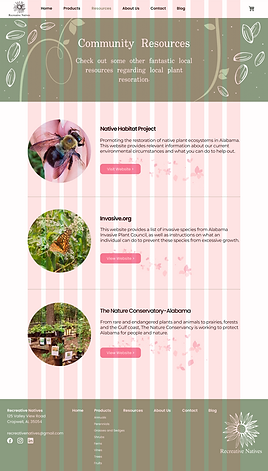
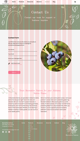
Explore the mockups below to see how the Recreative Natives website is designed to look on both desktop and mobile devices!
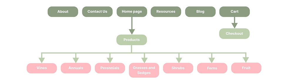
Website Architecture & User Flow
My first step in the process was to establish a clear, scalable website architecture. I designed a simple, hierarchical structure that makes it easy for users to explore plant offerings, learn about the mission, and access community resources.
This structure not only supports user-friendly navigation but is also optimized for SEO and built to accommodate future growth, including e-commerce integration.
Design Considerations
The visual design was guided by a strong brand identity. I used Figma to create a vibrant, earthy color palette and paired it with thoughtful typography to reflect the grounded, natural, and empowering tone of the brand.
A style sheet was assembled to ensure consistency across all visual elements and serve as a clear reference for development. This document became a key asset in maintaining brand cohesion throughout the design and development process.
Responsive Design Approach
Recognizing that the majority of users would be accessing the site from desktop devices, I applied a graceful degradation approach to responsive design. The desktop experience was designed to be visually rich and immersive, while the mobile version was simplified to prioritize clarity, performance, and usability on smaller screens.
Mockups were created for both desktop and mobile breakpoints to ensure a polished experience across platforms.
Development Considerations
From the beginning, I designed with development in mind. Each page layout followed a consistent grid system, with carefully considered margins and spacing to align with Bootstrap’s component framework. This ensured a smooth handoff to development and reduced the need for structural changes during implementation.
This project gave me the opportunity to combine purpose-driven design with user-centered strategy, creating a digital experience that’s as thoughtful as the mission behind it.