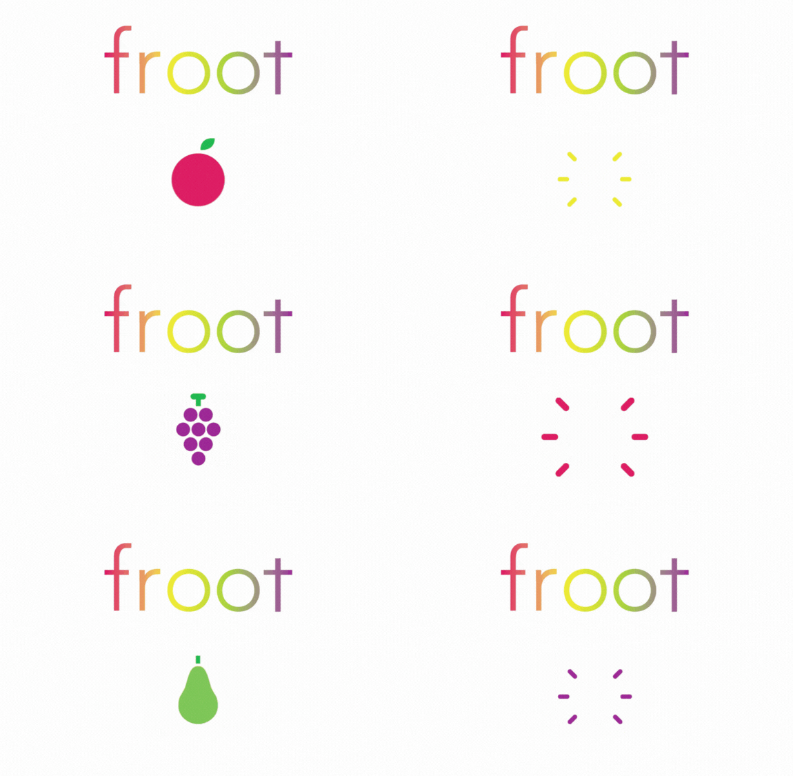


About froot
froot is a mobile-based application in which users view and share recipes for smoothies, smoothie bowls, and fresh plant-based snacks. The platform creates a specialized space for health-conscious consumers, raw food enthusiasts, and those looking to incorporate more plant-based options into their diet.
The target audience focuses on adults 18-30 who take in interest in the rapidly emerging plant-based movement - diet-driven and eco-conscious individuals with an interest in nutrition, culinary arts, and building a sense of community around their pursuits.
Check out the prototype of the froot application as it would appear on mobile devices.
Design Process & Visual Identity
The design process evolved through several key phases, starting with wireframes, advancing to detailed mockups, and culminating in a fully interactive prototype that demonstrates every major user flow. After finishing the digital wireframe process, I was able to parse out a simpler, more intuitive application architecture that would be simple for users to navigate, never being further than two taps away from the home screen, and creating iconography that's easy to interpret.
Each screen adheres to a strict margin system and follows mobile design best practices to ensure consistency and ease of handoff to developers. I created all assets from scratch using Figma and Adobe Illustrator, including iconography, illustrations, and layout components. These assets are documented in a comprehensive style sheet, along with the selected color palette and typography, to maintain visual coherence during the development phase.
%20(5).png)

Aesthetic & User Engagement
The visual direction of froot is vibrant, youthful, and clean, designed to reflect the energy and creativity of the community.
For recipe screens without user-uploaded images, I introduced background gradients that add depth without overwhelming the text content. This approach maintains a polished and cohesive aesthetic across all user scenarios, helping the app feel complete and visually compelling, even in early user stages.
The final prototype captures both the function and personality of the brand. The project served as a compelling example of how thoughtful UI/UX design can elevate a content-sharing platform into a lifestyle-driven digital community.

