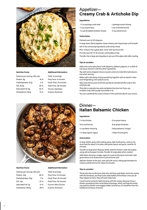
I worked on a project to create the standard layout for a recipe book, designing a template that could be used across the entire publication. The goal was to make the pages clean, straightforward, and satisfying to look at, while keeping recipes easy to follow. My priorities were readability, visual consistency, and a design that would translate well both digitally and in print.
I created a final layout that is simple, functional, and visually cohesive. Clean typography, balanced spacing, and consistent photo placement make the book approachable for readers, while subtle design elements add visual interest without distracting from the content.
Design Considerations
After finalizing the layout, I implemented it in Adobe InDesign, ensuring the template could be easily adapted for different recipe types. I standardized heading styles, body text, image sizes, and spacing for preparation tips and ingredient callouts to create a consistent visual system.
This structure allowed the book to maintain a clean, cohesive look across all pages while keeping each recipe easy to follow. Every design choice was intentional, especially the adjustments to page spacing, which ensured that when printed and bound, the content remained visually balanced rather than pulled toward the inner margin.
I also explored both horizontal and vertical layouts to determine which would be most readable. After testing variations of each, the vertical layout proved more effective, offering clearer hierarchy and a more intuitive flow of information for the reader.